A brief and colourful history of the telephone
With the launch of a new iPhone every September, there is often an emphasis on its new colours and the statement those colours make. Long before the iPhone, Bell placed a similar emphasis on the marketing of home telephones.
Soon after the introduction of handset telephones in 1930 (which featured a receiver and speaker in one hand-held unit), Bell began working on coloured telephone sets.
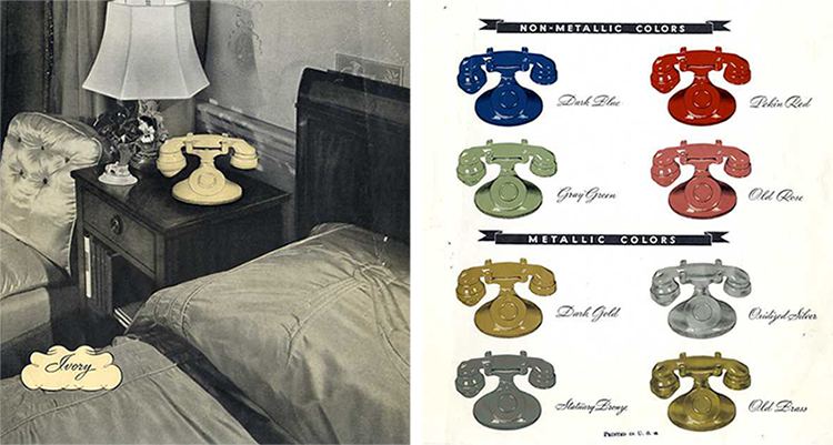
A group of artists and designers developed the five colours shown below: grey-green, dark blue, old rose, pekin red, and ivory. In addition, four metallic finishes were available: old brass, dark gold, statuary bronze and oxidized silver.

In these early days, only a relatively small quantity of coloured telephone sets were produced and that turned out to be a good things as the colourful offerings were not popular with the customers of the 1930s. One of the reasons for the lack of popularity may have been as the result of a complex production process – it was difficult to colour match the different pieces of the set, and the paint finishes were subject to discoloration and marking.
In 1941, the introduction of a new thermos-plastic material brought a significant change in the manufacturing process, with the housings and handsets evolving from metal to plastic. However, the challenges with colour matching were not entirely solved , as molded coloured components weren’t always uniform.
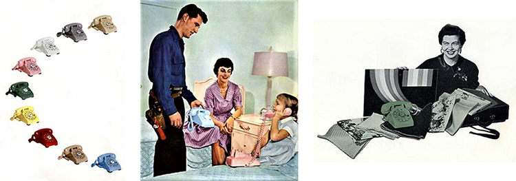
After WWII, industries including automobiles and household appliances started to use colour more boldly. While the telephone industry had been offering colour telephones for many years, continued efforts were made to s solve the problems related to colour matching. With that in mind, an entirely new telephone set was launched: the 500. The black set was introduced in Canada in 1952 while coloured options became available in 1955. Focus then shifted to offering new and different colours to keep up with fast-moving trends in interior decorating.

To help customers choose the most attractive colour for their particular decorating scheme, Bell’s service representatives completed courses on how to promote and talk about colour.
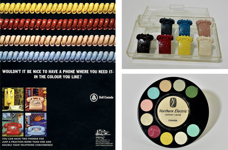
Special customer rooms were set up, complete with wall paper, draperies and upholstery to teach Bell sales reps about how home colors can either match or contrast with the basic colours of the 500 telephones: red, ivory, cool green, soft beige and white. Later, pastel pink and blue were added to the line up. Sales personnel were also provided with colour samples to help customers make the right choice.

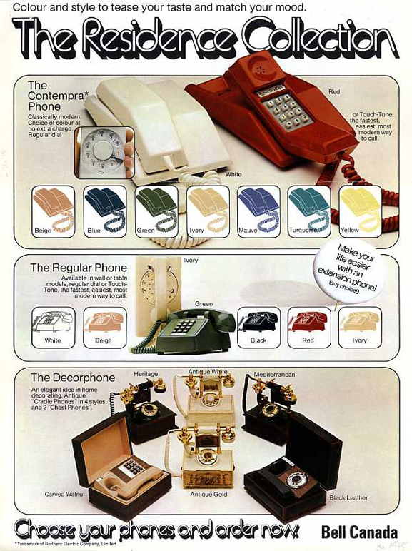
Colour was still an important factor when choosing a telephone in the 1970s, when Bell introduced a new line of phones to meet demand for the latest technological advancements, including sleeker models as part of The Residence Collection, as seen below.
And the best part of these phones, was they didn’t need a protective case around them, that would hide their noteworthy colours.
